EXECUTION
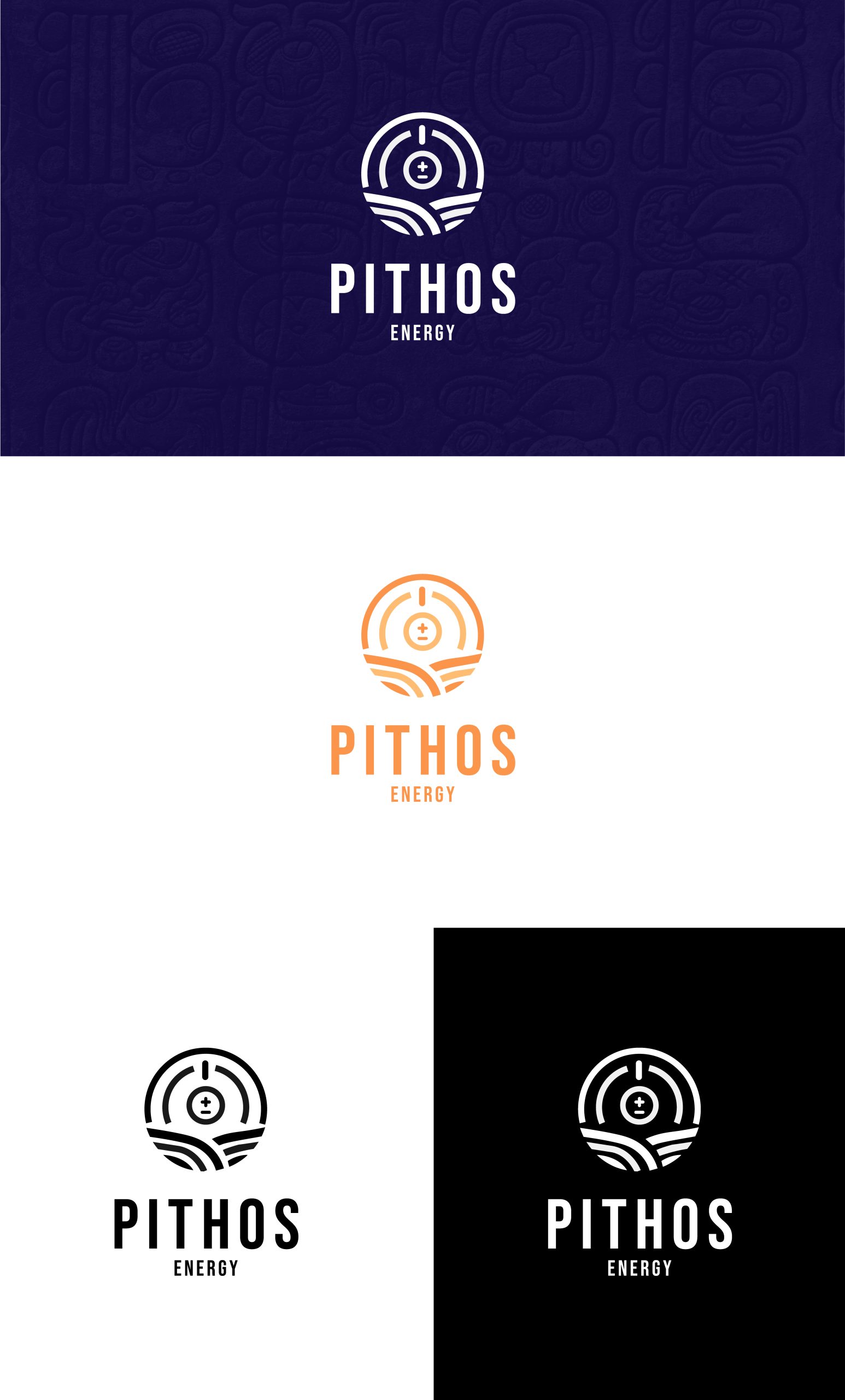
The execution involved collaborative design workshops with customers, historians, and graphic designers to ensure understanding, authenticity, and appeal. We chose a vibrant orange to symbolize creativity and energy, paired with a deep blue representing stability and trust.
The logo’s typography was carefully selected for its modern and bold aesthetics, ensuring high readability and a contemporary feel across various media. The design was streamlined across digital platforms and print materials to maintain consistency and maximize impact.
The launch was supported by a strategic marketing campaign to introduce the new brand identity to the target audience, utilizing both traditional and digital channels


-COO, Pithos Energy
© Copyright 2024. All rights reserved. MBE & SBE Certified.
MBE & SBE Certified.
All rights reserved.
© Copyright 2024.